Act as if we had added a whole new HTML element into the markup, rather
than applying a class to existing elements
::pseudo-element-name
::first-line
Robustly choose the first line of an element regardless of screen width
or font-size
Insert content into document using CSS
Use ::before and ::after with the content property
Display a string of text before or after the content of an element
Often used to insert a styled, empty string
::marker
Customize the styling of <li> elements’ bullets or numbers
::first-letter
::selection
Change user’s highlighting of text on the page
Attribute selectors
[attribute]
General selector that selects anything where the given attribute exists
selector[attribute]
Combine attribute selectors with other types of selectors
[attribute=“value”]
Match element with specific value of the specific attribute
Value can be regular expression
[attribute^=“value”]
Match strings from the start
[attribute$=“value”]
Match strings from the end
[attribute*=“valule”]
Match anywhere inside the string
Positioning
Default is position: static
position: relative positions elements according to the normal flow of the
document and then offset relative to itself based on the values of top,
right, bottom, left.
position: absolute allows you to position something at an exact point on the
screen without disturbing other elements
Using absolute positioning on an element will remove that element from the
normal document flow while being positioned relative to an ancestor
element
Good use cases
Modals
Image with a caption on it
Icons on top of other elements
position: fixed removes elements from the normal flow and position them
relative to the viewport
Navbars
Floating chat buttons
position: sticky act like normal elements until scrolled past, then they
behave like fixed elements
Section-headings
CSS Functions
calc(), min(), max(), clamp()
clamp(<min>, <ideal>, <max>): clamps a value between an upper and
lower bound, based on a set ideal value
Best practice: 45-75 character for line length for single-column page in a
serified text face
clamp(45ch, 50%, 75ch)
Best practice: padding management to ensure elements on larger screen sizes
have additional padding but maintain a minimum padding at smaller screen
sizes
Reference a CSS value many times throughout a file
Keep a color palette consistent
Redefine custom properties under different contexts to create dark and
light themes
Declare custom property
—<property-name>: <property-value>
Access custom property
var(—<property-name>, <fallback-value>)
Scope
The scope of a custom property is determined by the selector where it was
declared
Includes the selector and all of its descendants
Best practice: declare custom properties in :root selector
Creating themes with custom properties
Create a class attribute on the html element so that the page has a
default theme
In CSS, create two scopes for custom properties on the :root selector →
one for when html has class “dark” and one for when html has class “light”
Media queries
Another option for setting theme is using the user’s theme setting from
their OS or user agent (browser)
prefers-color-scheme media query checks for whether a user has a theme
preference on their OS/user agent
@media (prefers-color-scheme: dark) { :root { } }
Custom properties inherit. If no value is set for a custom property on a
given element, the value of its parent is used
Browser compatibility
Progressive Web Apps (PWAs) are web apps that use service workers,
manifests, and other web-platform features in combination with progressive
enhancement to give users an experience on par with native apps
Microsoft Word, Excel can be utilized through any browser without
installing any files
Different browsers use different engines to display information on the web
page
Chrome and Chromium use Blink, Safari uses WebKit
W3C develops web standards to maximize accessibility and consistency of the
web experience, develop new features in the CSS
Safari is the only browser on iOS, even Chrome and Firefox uses WebKit under
the hood on iOS
Browser inner workings
Main functionality: present the chosen web resource (HTML document, PDF,
image,…) whose location is specified by the user using a URI
Browser interprets and displays HTML according to HTML and CSS
specifications maintained by the W3C
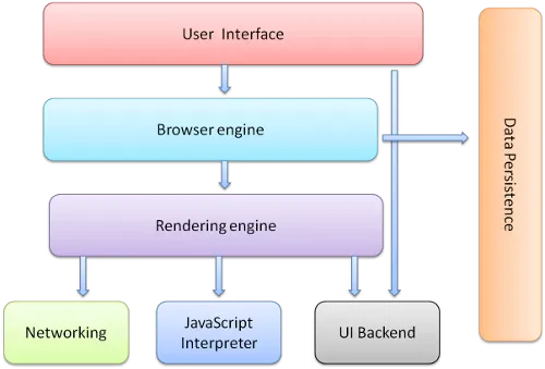
Main components - UI (address bar, back/forward button, bookmarking menu,
etc.) - Browser engine - Marshals actions between the UI and the rendering
engine - Rendering engine - Display requested content - Networking - For
network calls such as HTTP requests - UI backend - Draw basic widgets like
combo boxes and windows - JavaScript interpreter - Parse and execute
JavaScript code - Data storage - A persistence layer - Save data locally,
such as cookies - Support storage mechanisms such as localStorage,
IndexedDB, WebSQL, and FileSystem
Browsers run multiple instances of the rendering engine, one for each tab,
each tab runs in a separate process
The rendering engine
Frameworks and preprocessors
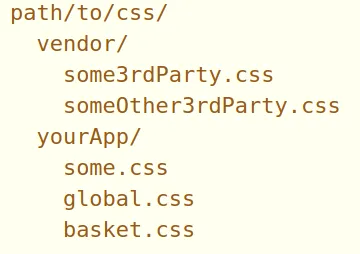
Frameworks package up commonly used CSS code
To use a framework, understand how it expects the site layout and which
classes it uses to designate its particular batch of styles
Preprocessors (precompilers)
Languages that help writing CSS more easily
Extensions to vanilla CSS with extra functionality such as nesting,
mixins, variables, nesting, and inheritance
Preprocessor syntax compiles into native CSS syntax, which is then
interpreted by the browsers
grid-row: 1 / span 3; → start from line number 1 and span 3 lines
Another way is to map out the whole structure with the grid container using
grid-template-areas
Assign each area a grid-area value as a name
Use . to indicate empty cells
Dynamic grid items
Use fractional units (fr) to distribute the remaining space in the grid
Minimum and maximum track sizes
The browser stops items from shrinking beyond the min-content value
minmax() can be used with grid-template-columns, grid-template-rows,
grid-auto-columns, grid-auto-rows, that takes in
The min size the grid track can be
The max size the grid track can be
clamp(minimum-size, ideal-size, maximum-size)
A dynamic value for the “ideal size” argument, and typically a static size
for the min and max size
Imperative when using elements that may have a tendency to overflow
auto-fit and auto-fill
auto-fill and auto-fit used independently give the grid a number of columns
that is flexible based on its size
When used with minmax(), we can have as many columns as possible without the
columns overflowing the grid
repeat(auto-fit, minmax(150px, 1fr))
The browsers determine the number of columns that can fit based on the
grid size and the min value. Then, it resizes the columns up to the max
value
auto-fill is mostly the same. But when the grid is expanded to a size where
another grid item could fit, and there are none left, the grid-items will
snap back to their min size