Skip to content
- Emmet
- Tool for writing HTML and CSS efficiently
- Abbreviations syntax
- Emmet uses syntax similar to CSS selectors for describing elements’
positions inside generated tree and elements’ attributes
- Nesting operators
- Child: >
- Sibling: +
- Climb-up: ^
- Multiplication: *
- Grouping: ()
- Attribute operators
- ID: elem#id
- Class: elem.class
- Custom attributes: [attr]
- Item numbering: $
- Changing numbering base and direction: @- and @3 (to start from 3)
- Text:
- Stop symbol: (Space)
- Wrap with abbreviation (Ctrl M + Ctrl W)
- Takes an abbreviation
- Expands it
- Places currently selected content in the last element of generated snippet
- Use wrap with abbreviation to wrap individual lines
- Select lines to wrap
- Use multiplication operator without number (e.g: ul>li*)
- Remove tag
- SVG (Scalable Vector Graphics)
- Easily scale without increasing file size
- Change properties through CSS and JavaScript
- Icons, graphs/charts, large & simple images, patterned backgrounds, applying
effects to other elements via SVG filters
- Defined using XML (Extensible Markup Language)
- Human-readable (similar to HTML with tags and attributes)
- Interoperable with HTML → can be put in HTML file to display SVG
- Drawbacks
- Inefficient at storing complex images
- Typically download the file or copy the code from a website or an image
editor that can create SVGs (Adobe Illustrator/Figma)
- Embedding SVGs
- Linked → same as <img>
- Inline: paste the code directly → allow altering properties by CSS or JS
- Can be avoided once front-end framework or build-tool
- Free SVG icon libraries: Material,
Feather,
The Noun Project,
Ionicons
- Use SVGs to generate images programmatically:
snap.svg, SVG.js
- Data visualization: d3.js
- Tables
- <table></table> tag
- <tr></tr>: table row
- <th></th>: table header
- <td></td>: table data
- Should be used for tabular data, not for laying out web pages
- Styling with <col>
- Below <table> tag, use <colgroup> followed by <col> * the number of
“style” columns
- <col> tags can then be styled, use span: 2/3/4/… to span columns
- <caption> tag to describe table contents
- Add structure with <thead>, <tfoot>, and <tbody>
- scope=“col/row/colgroup/rowgroup” used to indicate heading/subheadings
- Default styles
- Browsers have default styles by inserting CSS into every webpage
- Good practice: start projects with a CSS reset to ensure consistency across
browsers
- Units (bolded is preferred)
- Absolute units
- Relative units
- em, rem
- 1em is 1 * font size of an element (or its parent if using for
typographical properties like font-size)
- 1rem is the font-size of the root element (either :root or html)
- Viewport units
- vh, vw, vmin, vmax
- 1vh = 1% viewport’s height
- 1vw = 1% viewport’s width
- Good practice: use rem for font-size and px for everything else
- Text styles
- To get fonts that are not installed on a user’s computer, use an online font
library like Google Fonts,
Font Library
- Good practice: if you want text to be italic, use CSS property, otherwise,
if text has semantic emphasis, use correct HTML elements
- font-style, line-height, letter-spacing, text-transform, text-shadow, etc.
- More CSS properties
- background, border, box-shadow, overflow, opacity, etc.
- Advanced selectors
- > - the child combinator
- + - the adjacent sibling combinator
- Select an element that is adjacent to our target
- ~ - the general sibling combinator
- Select all of an element’s siblings
- Pseudo-class
- Selector that selects elements that are in a specific state, behaving as
if we had added a class into the HTML
- Cut down on excess classes in markup
- More flexible, maintainable code
- Keywords that start with a colon (:pseudo-class-name)
- User-action pseudo-classes
- :hover
- Applies when the user moves their pointer over an element
- :focus
- Applies when the user focuses the element by clicking or using
keyboard
- :active
- Applies to elements that are currently being clicked
- Structural pseudo-classes
- :root
- Represents the very top level of your document
- Place global CSS rules (box-sizing: border-box;) here
- :first-child
- :last-child
- :empty
- Match elements that have no children
- :only-child
- Match elements that don’t have any children
- :nth-child(3n), :nth-child(3n+3), :nth-child(3), :nth-child(even)
- Pseudo-elements
- Act as if we had added a whole new HTML element into the markup, rather
than applying a class to existing elements
- ::pseudo-element-name
- ::first-line
- Robustly choose the first line of an element regardless of screen width
or font-size
- Insert content into document using CSS
- Use ::before and ::after with the content property
- Display a string of text before or after the content of an element
- Often used to insert a styled, empty string
- ::marker
- Customize the styling of <li> elements’ bullets or numbers
- ::first-letter
- ::selection
- Change user’s highlighting of text on the page
- Attribute selectors
- [attribute]
- General selector that selects anything where the given attribute exists
- selector[attribute]
- Combine attribute selectors with other types of selectors
- [attribute=“value”]
- Match element with specific value of the specific attribute
- Value can be regular expression
- [attribute^=“value”]
- Match strings from the start
- [attribute$=“value”]
- Match strings from the end
- [attribute*=“valule”]
- Match anywhere inside the string
- Positioning
- Default is position: static
- position: relative positions elements according to the normal flow of the
document and then offset relative to itself based on the values of top,
right, bottom, left.
- position: absolute allows you to position something at an exact point on the
screen without disturbing other elements
- Using absolute positioning on an element will remove that element from the
normal document flow while being positioned relative to an ancestor
element
- Good use cases
- Modals
- Image with a caption on it
- Icons on top of other elements
- position: fixed removes elements from the normal flow and position them
relative to the viewport
- Navbars
- Floating chat buttons
- position: sticky act like normal elements until scrolled past, then they
behave like fixed elements
- CSS Functions
- calc(), min(), max(), clamp()
- clamp(<min>, <ideal>, <max>): clamps a value between an upper and
lower bound, based on a set ideal value
- Best practice: 45-75 character for line length for single-column page in a
serified text face
- Best practice: padding management to ensure elements on larger screen sizes
have additional padding but maintain a minimum padding at smaller screen
sizes
- padding: var(—blockPadding) max(2rem, 50vw - var(—contentWidth) / 2);
- Fluid typography
- Font-size: clamp(1.5rem, 5vw, 3rem);
- Custom properties
- Reference a CSS value many times throughout a file
- Keep a color palette consistent
- Redefine custom properties under different contexts to create dark and
light themes
- Declare custom property
- —<property-name>: <property-value>
- Access custom property
- var(—<property-name>, <fallback-value>)
- Scope
- The scope of a custom property is determined by the selector where it was
declared
- Includes the selector and all of its descendants
- Best practice: declare custom properties in :root selector
- Creating themes with custom properties
- Create a class attribute on the html element so that the page has a
default theme
- In CSS, create two scopes for custom properties on the :root selector →
one for when html has class “dark” and one for when html has class “light”
- Media queries
- Another option for setting theme is using the user’s theme setting from
their OS or user agent (browser)
- prefers-color-scheme media query checks for whether a user has a theme
preference on their OS/user agent
@media (prefers-color-scheme: dark) { :root { } }
- Custom properties inherit. If no value is set for a custom property on a
given element, the value of its parent is used
- Browser compatibility
- Progressive Web Apps (PWAs) are web apps that use service workers,
manifests, and other web-platform features in combination with progressive
enhancement to give users an experience on par with native apps
- Microsoft Word, Excel can be utilized through any browser without
installing any files
- Different browsers use different engines to display information on the web
page
- Chrome and Chromium use Blink, Safari uses WebKit
- W3C develops web standards to maximize accessibility and consistency of the
web experience, develop new features in the CSS
- caniuse.com
- Safari is the only browser on iOS, even Chrome and Firefox uses WebKit under
the hood on iOS
- Browser inner workings
- Main functionality: present the chosen web resource (HTML document, PDF,
image,…) whose location is specified by the user using a URI
- Browser interprets and displays HTML according to HTML and CSS
specifications maintained by the W3C
- Main components - UI (address bar, back/forward button, bookmarking menu,
etc.) - Browser engine - Marshals actions between the UI and the rendering
engine - Rendering engine - Display requested content - Networking - For
network calls such as HTTP requests - UI backend - Draw basic widgets like
combo boxes and windows - JavaScript interpreter - Parse and execute
JavaScript code - Data storage - A persistence layer - Save data locally,
such as cookies - Support storage mechanisms such as localStorage,
IndexedDB, WebSQL, and FileSystem
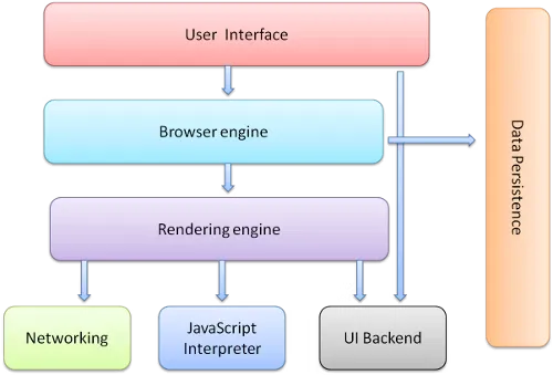
- Browsers run multiple instances of the rendering engine, one for each tab,
each tab runs in a separate process
- The rendering engine
- Frameworks and preprocessors
- Frameworks package up commonly used CSS code
- To use a framework, understand how it expects the site layout and which
classes it uses to designate its particular batch of styles
- Preprocessors (precompilers)
- Languages that help writing CSS more easily
- Extensions to vanilla CSS with extra functionality such as nesting,
mixins, variables, nesting, and inheritance
- Preprocessor syntax compiles into native CSS syntax, which is then
interpreted by the browsers
- Sass, LESS, Stylus
- Maintainable CSS
- Modular, scalable, and maintainable
- Use semantic HTML class names
- Reuse style appropriately
- Use ID when there’s only one instance, a class when there are several
- Use IDs when need to enable particular behavior for browsers and assistive
technology, avoid using them as hooks for styles
- Naming convention
- .<module>[—<module modifier>][-<component>][-<state>]
- searchResults — searchResults-heading — searchResults-isLoading
- Think in terms of modules, components, and states
- Modules are made up of components
- Add states as additional classes to the module element it pertains
- Versioning
- Add number suffix to module name to A/B test
- After testing, you can delete either because there is no intertwining
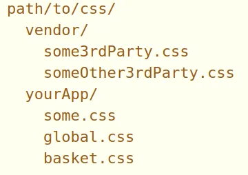
- Organization
- Forms
- Gateway of the users to the backend
- Frontend forms will be hooked to backend systems to provide data
- Form element
- Wraps all of the inputs a user will interact with on a form
- Accepts two essential attributes
- action takes a URL value where it should send its data to be processed
- method tells the browser which HTTP request method it should use to
submit the form
- GET and POST are most common
- GET to retrieve something from a server
- POST to change something on the server
- Form controls
- Elements user interact with on the form (text boxes, dropdowns,
checkboxes, and buttons)
- Input element
- <input>
- type attribute tells the browser what type of data it should expect
and how it should render the input element
- “text”, “email”, “password”, “number”, “date”, “hidden”, “image”,
“file”, “search”, “tel”, “url”, “range”, “color”
- email input type performs client-side error validation
- placeholder attribute guides users on what to enter in form elements
- name attribute lets the backend know what each piece of data
represents (should always have)
- value attribute defines the default value
- <label>
- Inform the expected type of data
- for attribute associates the label with a particular input
- The input associated with a label needs an id attribute with the
same value as the label’s for attribute
- When clicked, the label focus the cursor on the input → accessible
- Multiple labels should be nested inside one <label>
- <textarea>
- Technically not an input element, but can provide an input box that
accepts text that spans multiple lines
- <textarea rows=“20” cols=“60”>Some initial content</textarea>
- Put default value between opening and closing tags
- You can use form controls outside of forms, even when there’s no backend
server → use with JavaScript
- Selection elements
- Select dropdown: <select>
- Has indented <option>‘s
- value attribute will be sent to the server
- Default selected <option> has a selected attribute
- Radio buttons
- At most one can be selected
- <input> with type=“radio”
- When one of the radio buttons with the same name attribute is clicked,
it will deselect the first one
- Default selected radio button has checked attribute
- Should nest inside a <fieldset> for accessibility
- Checkboxes
- Allow multiple options
- <input> with type=“checkbox”
- Default selected checkboxes have checked attribute
- Buttons
- type attribute tells the browser which kind of button it is
- submit submits the form the button is contained within
- reset sets all form inputs back to their initial state
- button is a generic type commonly used with JS for creating
interactive UIs
- Organizing form elements
- HTML provides elements to organize forms into sections
- <fieldset> groups related form inputs into one logical unit
- <legend> gives field sets a heading
- List of options can be split using the <optgroup> element, which takes
a label attribute
- Styling forms
- Override default form styles because browser default form styles differ
from one another
- Some elements like calendar or date pickers are impossible to style →
build custom font controls with JS or use JS libraries
- Best practice: Wrap a label and its widget with <li> within <ul>
or <ol>
- Form validation
- Protect backend systems from receiving incorrect data, enhance UX
- Required validation
- Add required attribute to required form controls
- Text length validation
- minlength, maxlength attribute
- Number range validation
- Pattern validation
- pattern attribute with a regular expression
- Change validation message with title attribute
- Styling validations
- Target form controls that pass or fail validations with :valid and
:invalid pseudo-classes
- CSS Grid
- Use cases of Grid
- Great for lining things up in two directions
- Calculations are done in each row one at a time
- Things don’t line up, dependent on the size of the content
- Better for overlapping things
- Use grid when using layout-first design
- Use cases of Flexbox - Great for lining things up in one direction - Flexbox
can optionally wrap - Use flexbox when using content-first design
- Grid consists of a container and items
- Make an element a grid container with display: grid
- Only direct child elements become grid items
- Define column and row tracks with grid-template-columns and
grid-template-rows
- Or use shorthand grid-template (rows / columns)
- repeat(2, 150px) = 150px 150px
- Implicit vs. explicit grids
- When the grid needs more tracks for extra content without available
predefined tracks, it will implicitly define new grid tracks
- Set the implicit grid track sizes using grid-auto-rows and grid-auto-columns
- By default, grid will add additional content with implicit rows
- Use grid-auto-flow: columns to handle overflow with extra columns
- Gap
- Define using column-gap and row-gap
- Positioning grid elements
- Use grid-column-start, grid-column-end, grid-row-start, and grid-row-end
with desired line numbers on individual elements
- Can use negative numbers
- Shorthand
- grid-column: start/end
- grid-row: start/end
- Even shorter shorthand
- grid-area: grid-row-start / grid-column-start / grid-row-end /
grid-column-end
- Can use span keyword
- grid-row: 1 / span 3; → start from line number 1 and span 3 lines
- Another way is to map out the whole structure with the grid container using
grid-template-areas
- Assign each area a grid-area value as a name
- Use . to indicate empty cells
- Dynamic grid items
- Use fractional units (fr) to distribute the remaining space in the grid
- Minimum and maximum track sizes
- The browser stops items from shrinking beyond the min-content value
- minmax() can be used with grid-template-columns, grid-template-rows,
grid-auto-columns, grid-auto-rows, that takes in
- The min size the grid track can be
- The max size the grid track can be
- clamp(minimum-size, ideal-size, maximum-size)
- A dynamic value for the “ideal size” argument, and typically a static size
for the min and max size
- Imperative when using elements that may have a tendency to overflow
- auto-fit and auto-fill
- auto-fill and auto-fit used independently give the grid a number of columns
that is flexible based on its size
- When used with minmax(), we can have as many columns as possible without the
columns overflowing the grid
- repeat(auto-fit, minmax(150px, 1fr))
- The browsers determine the number of columns that can fit based on the
grid size and the min value. Then, it resizes the columns up to the max
value
- auto-fill is mostly the same. But when the grid is expanded to a size where
another grid item could fit, and there are none left, the grid-items will
snap back to their min size