Skip to content
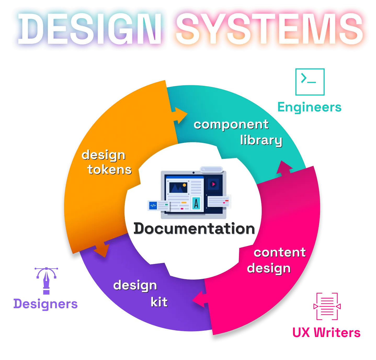
- 5 pillars
- Design Tokens
- Design Kit
- Component Library
- Content Design
- Documentation site
- Design Tokens
- The foundation of the brand
- Most common
- Colors in the brand palette
- Fonts
- Scale sizes
- Shared across Design Kits and Component Library
- Design Kit (a.k.a UI Kit)
- Set of patterns or components existing in design tools
- Follows the design rules and is built using the Design Tokens
- Component Library
- Code side of the Design Kit
- List of reusable components that developers should use
- Uses the Design Tokens for a consistent design signature that is easy to
maintain
- Content Design
- Created by UX Writers, Content Designers, or Content Strategists
- To be used by everyone - writers or non-writers
- Defines voice, tone and glossary, rules and recommendations for consistent
writing
- Documentation site
- The central piece in the Design System
- Aggregates Design Tokens, Design Kit, and Component Library into a single
site
- Adds rules and guidelines about when and why a pattern or component should
be used or not
- Benefits
- Reduced costs
- More team confidence
- Higher quality
- Greater productivity
- Consistency
- Design Tokens
- All the values needed to construct and maintain a design system - spacing,
color, typography, object styles, animations, etc - represented as data